Turn on suggestions
Auto-suggest helps you quickly narrow down your search results by suggesting possible matches as you type.
Showing results for
Dashboards & Visualizations
Turn on suggestions
Auto-suggest helps you quickly narrow down your search results by suggesting possible matches as you type.
Showing results for
- Splunk Answers
- :
- Using Splunk
- :
- Dashboards & Visualizations
- :
- What is the second label on my pie
Options
- Subscribe to RSS Feed
- Mark Topic as New
- Mark Topic as Read
- Float this Topic for Current User
- Bookmark Topic
- Subscribe to Topic
- Mute Topic
- Printer Friendly Page
- Mark as New
- Bookmark Message
- Subscribe to Message
- Mute Message
- Subscribe to RSS Feed
- Permalink
- Report Inappropriate Content
BigShak
Explorer
01-18-2022
08:36 AM
Hello there,
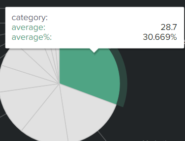
Can someone explain to me why there is a second "average" when I hover one slice of the pie chart?
The first "average" is my calculation, the second with the % ("average%") came out of nowhere and I don't know why they have different results.
Can i get rid of it?
In case you need my search :
index=blabla | stats count by category | eventstats sum(count) as total | eval average=round((count/total)*100,2) | sort 10 - average | fields category average
Thanks.
1 Solution
- Mark as New
- Bookmark Message
- Subscribe to Message
- Mute Message
- Subscribe to RSS Feed
- Permalink
- Report Inappropriate Content
ITWhisperer

SplunkTrust
01-18-2022
09:41 AM
Is it probably (helpfully) put in by the chart viz.
You can modify this with some CSS
    <panel depends="$stayhidden$">
      <html>
        <style>
          #panel_id_for_pie table.highcharts-tooltip tbody tr:nth-child(2) td{
            display:none !important;
          }
        </style>
      </html>
    </panel>
<panel id="panel_id_for_pie">- Mark as New
- Bookmark Message
- Subscribe to Message
- Mute Message
- Subscribe to RSS Feed
- Permalink
- Report Inappropriate Content
ITWhisperer

SplunkTrust
01-18-2022
09:41 AM
Is it probably (helpfully) put in by the chart viz.
You can modify this with some CSS
    <panel depends="$stayhidden$">
      <html>
        <style>
          #panel_id_for_pie table.highcharts-tooltip tbody tr:nth-child(2) td{
            display:none !important;
          }
        </style>
      </html>
    </panel>
    <panel id="panel_id_for_pie">
Get Updates on the Splunk Community!
Modern way of developing distributed application using OTel
Recently, I had the opportunity to work on a complex microservice using Spring boot and Quarkus to develop a ...
Enterprise Security Content Update (ESCU) | New Releases
Last month, the Splunk Threat Research Team had 3 releases of new security content via the Enterprise Security ...
Archived Metrics Now Available for APAC and EMEA realms
We’re excited to announce the launch of Archived Metrics in Splunk Infrastructure Monitoring for our customers ...

